Visual Basic Concepts
A label control displays text that the user cannot directly change. You can use labels to identify controls, such as text boxes and scroll bars, that do not have their own Caption property. The actual text displayed in a label is controlled by the Caption property, which can be set at design time in the Properties window or at run time by assigning it in code.
By default, the caption is the only visible part of the label control. However, if you set the BorderStyle property to 1 (which you can do at design time), the label appears with a border — giving it a look similar to a text box. You can also change the appearance of the label by setting the BackColor, BackStyle, ForeColor, and Font properties.
Single-line label captions can be specified at design time in the Properties window. But what if you want to enter a longer caption, or a caption that will change at run time? Labels have two properties that help you size the controls to fit larger or smaller captions: AutoSize and WordWrap.
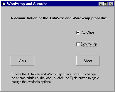
The AutoSize property determines if a control should be automatically resized to fit its contents. If set to True, the label grows horizontally to fit its contents, as shown in Figure 3.5.
Figure 3.5 AutoSize example

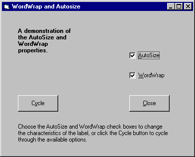
The WordWrap property causes the label to grow vertically to fit its contents, while retaining the same width, as shown in Figure 3.6. For a working version of this example, see Wordwrap.frm in the Controls.vbp sample application.
Figure 3.6 WordWrap example

Note If you run the AutoSize example from Controls.vbp, you'll notice that for the WordWrap example to actually work, both check boxes must be selected. This is because, for the label's WordWrap property to take effect, AutoSize must be set to True. The width of the label is increased only if the width of a single word exceeds the current width of the control.
For More Information For additional information on the label control's properties, see "Using Visual Basic's Standard Controls."