A button is a window control that a user can turn on or off to provide input to an application. Buttons can be used alone or in groups and can appear with or without a label. Buttons belong to the BUTTON window class.
Windows CE provides four kinds of buttons: check box, push button, radio button, and group box. Each button type has one or more styles that affect its appearance, behavior, or both. For a list of supported button styles, see Window and Control Styles.
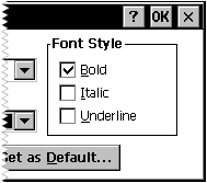
A check box contains one or more items that appear checked when selected. More than one item in a check box can be selected at one time. Applications display check boxes in a group box to enable a user to choose from a set of related, but independent, options. When a user selects a check box, the check box receives the keyboard focus from Windows CE, which sends the check box parent window a WM_COMMAND message containing the BN_CLICKED notification code. The parent window does not acknowledge this message if the message is sent from an automatic check box or automatic three-state check box because Windows CE sets the check state for those styles. The parent window must acknowledge the message if the message is sent from an application-defined check box or three-state check box because the parent window, not Windows CE, is responsible for setting the check state for those styles. Regardless of the check box style, Windows CE repaints the check box once its state is changed. The following screen shot shows a check box.

 To create a check box using the CreateWindow function
For a complete listing of supported styles, see Window and Control Styles
 To create a check box in a dialog box
CHECKBOX text, id, x, y, width, height [[, style [[, extended-style]]]]
Here, text is the text displayed to the right of the control and id is the value that identifies the check box. The upper-left corner of the control is positioned at x, y, and its dimension is determined by width and height. Style and extended-style determine the appearance of the check box. The CHECKBOX resource statement creates a manual check box. That is, your application must check and uncheck the box each time a user selects the control. If you want Windows CE to toggle between checked and unchecked states when a user selects the control, use the AUTOCHECKBOX resource statement. For a complete listing of supported styles, see Window and Control Styles.
A push button, also known as a command button, is a small, rectangular control that a user can turn on or off by tapping it with the stylus. A push button has a raised appearance in its default, or off state, and a depressed appearance in its on state. Windows CE supports owner-drawn push buttons which are discussed later.
When a user taps a push button, it receives the keyboard focus from Windows CE, which sends the button's parent window a WM_COMMAND message containing the BN_CLICKED notification code. In response, the dialog box closes and carries out the operation indicated by the button.
Note Windows CE does not support the BS_BITMAP, BS_FLAT, BS_ICON, BS_PUSHBOX, BS_TEXT, or BS_USERBUTTON styles. Use the BS_OWNERDRAW style to create the effects you would otherwise achieve by using the BS_BITMAP, BS_ICON, or BS_USERBUTTON button styles.
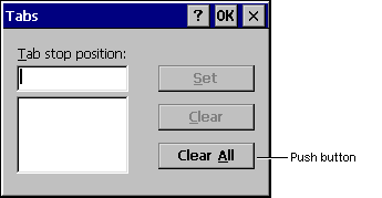
The following screen shot shows a push button for the Tabs dialog box.
 To create a push button using CreateWindow
For a complete listing of supported styles, see Window and Control Styles.
 To create a push button in a dialog box
PUSHBUTTON "string", id, x, y, width, height [[, style [[, extended-style]]]]
Here, string is the text you want displayed inside the push button, and id is the value that identifies the push button. The upper-left corner of the control is positioned at coordinates x, y, and its dimension is determined by the values width and height. Style and extended-style determine the push button's appearance.
A radio button, also known as an option button, is similar to a check box in that you can select from one or more options. Unlike a check box, however, when there are multiple radio buttons only one item can be selected, making radio buttons mutually exclusive.
When a user selects an automatic radio button, Windows CE sets the check state of all other radio buttons within the same group to unchecked. For standard radio buttons, use the WS_GROUP style to achieve the same effect.
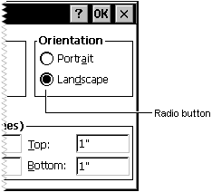
Windows CE supports most of the radio button styles that Windows-based desktop platforms support; it does not support the BS_LEFTTEXT style that places the radio button to the right of the associated text. You can achieve the same effect by using the BS_RIGHTBUTTON style. The following screen shot shows a radio button.
 To create a radio button using CreateWindow
For a complete listing of supported styles, see Window and Control Styles.
 To create a radio button in a dialog box
RADIOBUTTON "string", id, x, y, width, height [[, style [[, extended-style]]]]
Here, string is the text you want displayed inside the radio button, and id is the value that identifies the radio button. The upper-left corner of the control is positioned at coordinates x, y, and its dimension is determined by the values width and height. Style and extended-style determine the appearance of the radio button. The RADIOBUTTON resource statement creates a manual radio button. This means that your application must manually clear other radio buttons in the group each time a user selects a button. If you want Windows CE to automatically clear other radio buttons when a user selects an option, use the AUTORADIOBUTTON resource statement.
A group box is a rectangular area within a dialog box in which you can group together semantically related controls. Controls are grouped by drawing a rectangular border around them. Any text associated with the group box is displayed in its upper-left corner. The purpose of a group box is to organize controls related by a common purpose, usually indicated by the label. The group box has only one style, defined by the constant BS_GROUPBOX. Because a group box cannot be selected, it has no check state, focus state, or push state. An application cannot send messages to a group box.
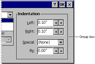
Because group boxes are opaque in Windows CE, add them to your dialog box template after you add other elements. Anything you add to the template after you add the group box will be hidden under it. By adding group boxes last, you ensure that the group boxes are at the bottom of the z-order and do not hide other controls. The z-order is a stack of overlapping windows. The following screen shot shows a group box.
 To create a group box using the CreateWindow function
For a complete listing of supported styles, see Window and Control Styles.
 To create a group box in a dialog box
GROUPBOX "title", id, x, y, width, height [[, style [[, extended-style]]]]
Here, title is the title of the box, and id is the value that identifies the group box. The upper-left corner of the control is positioned at coordinates x, y, and its dimension is determined by the values width and height. Style and extended-style determine the group box appearance.
When a user selects a button, either the OS or the application must change one or more of the button's state elements. A button's state can be characterized by its focus state, push state, and check state. Windows CE automatically changes the focus state for all button types, the push state for push buttons, and the check state for all automatic buttons. The application must make all other state changes, taking into account the button's type, style, and current state. An application can determine a button's state by sending it a BM_GETCHECK or BM_GETSTATE message; the application can set a button's state by sending it a BM_SETCHECK or BM_SETSTATE message.