A trackbar is a window containing a slider and tick marks. You use a trackbar as a scrolling control: when you drag the slider (sometimes referred to as the thumb), the control sends a message to indicate the change in the slider's position. A horizontal trackbar (the default style) sends a WM_HSCROLL message, and a vertical trackbar uses a WM_VSCROLL message. The tick marks indicate how many points you can move left and right or up and down.
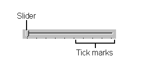
In Figure 2-1, you can see a simple horizontal trackbar with a range of 1 through 10.
Figure 2-1.
Trackbars are based on scroll bar controls, and many of the styles and notifications for trackbars are similar to those for scroll bars. By default, the tick marks appear on the right side of a vertical trackbar and on the bottom of a horizontal trackbar. When a user drags the slider or clicks on either side of it, the slider moves in the appropriate direction, tick by tick. In other words, scrolling is not continuous; instead, you scroll in increments indicated by the tick marks. For example, a trackbar with 10 ticks and a range of 1 through 100 allows you to scroll only in increments of 10. You can change the frequency of ticks programmatically.
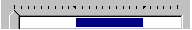
You can set a portion of a trackbar as a selection range. A blue line in the channel of the trackbar indicates this selection range, and two arrows (replacing the tick marks) indicate its beginning and end. The selection range is a visual representation only; it does not prevent the user from moving the slider outside the selected area. This would be useful, for example, in a scheduling application; the user could see the range of ticks corresponding to the hours for which meetings have been scheduled. In Figure 2-2, the line in the trackbar's channel shows the selection range. To change this range, the application sends a message, TBM_SETSEL, or uses MFC's SetSelection member function.
Figure 2-2.
Table 2-1 lists the styles you can choose when creating a trackbar. You can combine styles for different looks, depending on the effect you want.
| Style | Description |
| TBS_AUTOTICKS | Adds tick marks when you set the range on the trackbar by using the TBM_SETRANGE message (or the MFC SetRange member function). |
| TBS_BOTH | Places ticks on both sides of the trackbar. |
| TBS_BOTTOM | Places ticks on the bottom of a horizontal trackbar. |
| TBS_ENABLESEL-RANGE | Allows you to set a selection range on the trackbar. |
| TBS_FIXEDLENGTH | Specifies that the length of the slider remains the same even if the selection range changes. |
| TBS_HORZ | Specifies a horizontal trackbar. This is the default. |
| TBS_LEFT | Places ticks on the left side of a vertical trackbar. |
| TBS_NOTHUMB | Specifies that the trackbar has no slider. |
| TBS_NOTICKS | Specifies that no ticks are placed on the trackbar. |
| TBS_RIGHT | Places ticks on the right side of a vertical trackbar. |
| TBS_TOP | Places ticks on the top of a horizontal trackbar. |
| TBS_VERT | Specifies a vertical trackbar. |
Table 2-1.
Trackbar styles.
I wrote a small sample called SLIDER (trackbars themselves are sometimes referred to as sliders) to demonstrate the trackbar styles and how they work. The design goals for SLIDER included the following:
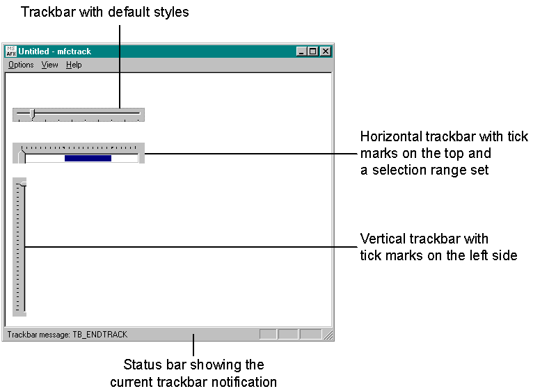
I also wrote an MFC-equivalent sample called MFCTRACK that demonstrates how to create and manipulate trackbars using the MFC CSliderCtrl class. You can see the MFCTRACK sample in Figure 2-3.
Figure 2-3.