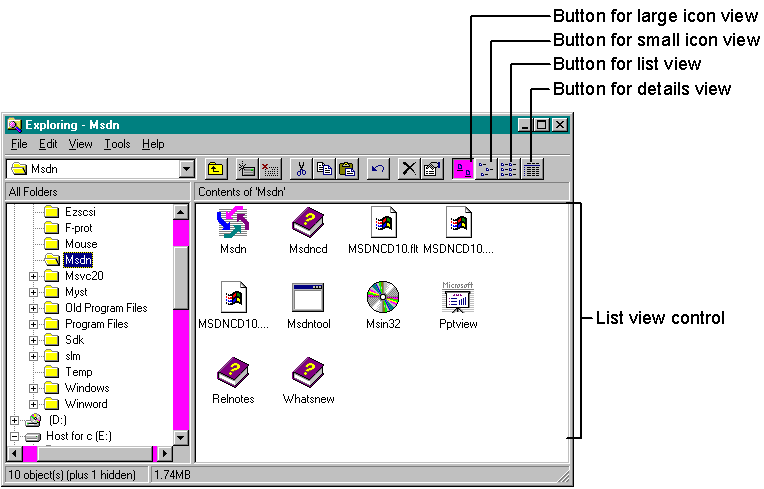
A list view control displays a collection of items, such as files or folders, that can be manipulated in a variety of ways. For example, a user can drag an item to a new location or sort the collection by clicking a column header. If you've run Windows Explorer, you've seen a list view control—the large window on the right, pointed out in Figure 3-3.
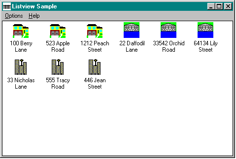
A list view control can display its items in one of four ways (called views): in large icon view (also known as standard icon view), using the items' large icons; in small icon view, using a smaller icon size; in list view; or in details view (also known as report view). In large icon view, shown in Figure 3-4, each item is represented by a full-size icon and a text label below the icon. The user can drag items to any location in the list view window. This illustration comes from the LISTVIEW sample (its MFC counterpart is called MFCLIST), which demonstrates a list view control that contains real estate listings, with each item representing a house for sale. (The addresses are fictional, of course.)
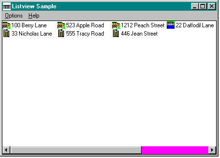
In small icon view, shown in Figure 3-5 on page 76, each item appears with a small icon and a text label to the right of the icon, thus saving screen real estate. As in large icon view, the user can drag the items to any location in the window.
Figure 3-3.

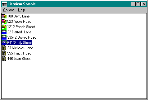
List view, like small icon view, displays each item with a small icon and a text label to the right. In list view, however, the items are arranged in a column, as shown in Figure 3-6, and the user cannot drag the items.
Figure 3-6.
In details view, items are displayed with their small icons and text labels, with each item on its own line and additional information about the item displayed in subsequent columns across the screen. The leftmost column contains the icon and the text label. A column header shows the title of each column, as you can see in Figure 3-7.
Figure 3-7.
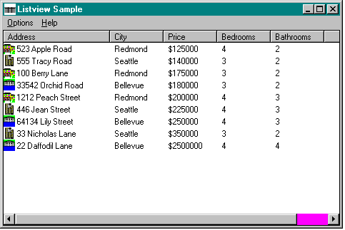
A column header is a horizontal window usually positioned above columns of text or numbers and containing a title for each column. A column header can be a stand-alone control (although I cannot for the life of me think of a good reason to use one this way), or it can be part of a list view control. When you use a column header in a list view control, it is “free”—that is, you don't have to create the header control yourself.
A header control can be divided into parts, called header items, whose width can be set by the user. A header item can behave like a command button, performing some action (such as sorting data according to a specified criterion) when the user clicks it. For example, clicking the Price header item shown in Figure 3-7 sorts the list by the price of the house. Header items appear as text on a gray background.
NOTE: Column headers do not support a keyboard interface and, as a result, do not accept the input focus.
A header item can have a string, a bitmapped image, and an application-defined 32-bit value associated with it. The string and the image appear within the boundaries of the item. If an item displays both a string and an image, the image is located above the string. If the string and the image overlap, the string overwrites part of the image.
For information about some of the messages and MFC member functions that header controls support, refer to Table 1-3 in Chapter 1 (page 17). You can find details about the remaining messages, such as HDM_LAYOUT, and MFC member functions, such as Layout, in the Win32 SDK documentation or the MFC 3.1 documentation.