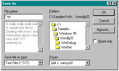
You need to ensure that you allocate enough space to accommodate long filenames in your edit fields, list boxes, and static text strings. In the old-style Open and Save As common dialog boxes (in 16-bit Windows), for instance, the field for entering a filename isn't really all that large, as you can see in Figure 8-1. If a filename is fairly long, the user has to scroll horizontally to see the entire name—a task that is even more frustrating without a horizontal scroll bar. Not viewing the complete name can also cause the user to confuse similar filenames.
Figure 8-1.

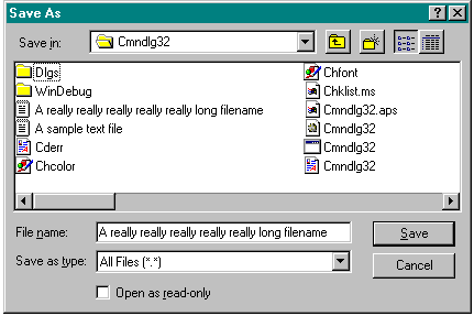
The design of the new common dialog boxes for opening and saving files (in 32-bit Windows) improves the situation. Notice in Figure 8-2 on the following page that the edit box in which current filename and path information is entered or displayed has been expanded to let the user see more of the filename without scrolling.
Figure 8-2.

In short, take a look at the dialog boxes in your applications and be sure to update the width of edit boxes to allow for longer filenames. Of course, if you use only the common dialog boxes, you don't have to worry about this because the common dialog library takes care of it.
An alternative to providing new dialog boxes to support longer filenames is to use only nonbold fonts (which require less space) in your edit boxes. You'll find that allowing enough room for 30 to 40 characters in a nonbold font is adequate for most purposes.