Design Specifications and Guidelines - Visual Design
Provide visual feedback when the user selects an item to enable the user to distinguish it from items that are not selected. Selection appearance generally depends on the object and the context in which the selection appears.
Display an object with its selection appearance as the user performs a selection operation. For example, display the selection appearance when the user clicks the primary mouse button to select an object.
![]() More Information
More Information
For more information about selection techniques, see Chapter 6, "General Interaction Techniques."
It is best to display the selection appearance only for the scope, area, or level (window or pane) that is active. This helps the user recognize which selection currently applies and the extent of the scope of that selection. Therefore, avoid displaying selections in inactive windows or panes, or at nested levels.
However, in other contexts, it may still be appropriate to display the selection appearance simultaneously in multiple contexts. For example, when the user selects an object and then selects a menu item to apply to that object, the selection appearance is always displayed for both the object and the menu item because it is clear where the user is directing the input. In some cases, you need to show simultaneous selection, but with the secondary selection distinguished from the active selection. In these cases, you can draw an outline in the selection highlight color around the secondary selection or use some similar variant of the standard selection highlight technique.
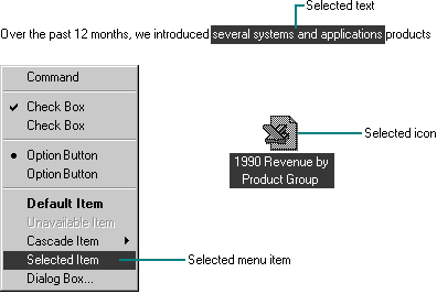
For many types of objects, you can display the object, its background, or some distinguishing part of the object using the system highlight foreground and background colors. Figure 14.39 shows examples of selection appearances.
![]() More Information
More Information
The GetSysColor function provides access to the current setting for the system selection highlight color (COLOR_HIGHLIGHTTEXT) and selection background color (COLOR_HIGHLIGHT). Always use these two system colors in their proper foreground and background combination. For more information about this function, see the Microsoft Platform SDK on the MSDN Online Web site at http://msdn.microsoft.com/ui/guide/sdk.asp.

Figure 14.39 Selection appearance
In a secondary window, it may be appropriate to display selection highlighting when the highlight is also being used to reflect the setting for a control. For example, in list boxes, highlighting often indicates a current setting. In cases like this, provide an input focus indication as well so the user can distinguish when input is being directed to another control in the window. You can also use check marks instead of highlighting to indicate the setting.
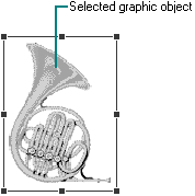
Handles provide access to operations for an object, but they can also indicate selection for some kinds of objects. The typical handle is a solid, filled square box that appears on the edge of the object, as shown in Figure 14.40.

Figure 14.40 Selected graphic object with handles
The handle is hollow when it indicates selection but is not a control point by which the user can manipulate the object. Figure 14.41 shows a solid handle and a hollow handle.
Figure 14.41 Solid and hollow handles (click to enlarge image)
Base the default size of a handle on the current system settings for resizable window border thickness and on the thickness of the lines in the current system setting for an edge. Then your handles will be sized appropriately to be visible, and will be easily targeted with the mouse when the user changes window border widths or resolutions. Similarly, the colors you use to draw handles should be based on system color metrics so that when the user changes the default system colors, handles change appropriately.
![]() More Information
More Information
The system settings for window border and edge metrics can be accessed using the GetSystemMetrics function. For more information about this function, see the Microsoft Platform SDK on the MSDN Online Web site at http://msdn.microsoft.com/ui/guide/sdk.asp.
When you use a handle to indicate selection, display the handle in the system highlight color. To help distinguish the handle from the variable background, draw a border around the edge of the handle using the system's setting for highlighted text. For hollow handles, use the opposite: the selection highlight color for the border and the highlighted text color for the fill color. If you display handles for an object even when it is not selected, display the handles in a different color, such as the window text color, so that the user does not confuse it as part of the active selection.
Fundamentals of Designing User Interaction
Design Specifications and Guidelines