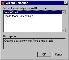
Two form wizards are available to help you create forms.
Just as reports make it easy to print your tables and queries, forms provide a convenient way to display, enter, and edit your database information. You can create forms that mimic the paper forms you’re used to, providing a familiar data entry environment.
This chapter shows how to create interactive forms from tables and views, using form wizards, builders, and the Form Designer. For information about using forms as the basis for building an application, see Chapter 9, Creating Forms, in the Programmer’s Guide.
This chapter discusses:
Forms display the fields and records in your tables and views, and usually include navigation controls to help you move from record to record.
You can create forms in Visual FoxPro in any of these ways:
Whenever you want to create a new form, you can use a form wizard to help you set it up. The wizard will ask you a series of questions and build a form for you based on your answers. You can choose from several different style options and preview your form before creating it.
To create a form with a wizard
Two form wizards are available to help you create forms.

You can also access the form wizards from the menu by choosing the Wizards command from the Tools menu, and selecting Form.
Visual FoxPro provides two different form wizards to help you create forms:
Forms you create with the form wizards have a standard set of navigation buttons so you can display different records in the form, edit records, search for records, and so on. If you create a form within a database, the Form Wizard can use input mask and format settings stored in the database.
If you want to create your own form without using a wizard, use the Form Designer. With the Form Designer, you can add fields and controls to your form, and customize it by adjusting and aligning the controls.
The Quick Form command is provided to make it easier to get started creating a form. The Quick Form command displays the Form Builder, which adds selected fields from tables or views to your form.
To create a new form
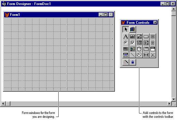
The Form Designer window appears so you can begin creating your form.
The Form Designer window
When you want to quickly place the fields from a table or view into a form, choose Quick Form on the Form menu. Quick Form starts the Form Builder, which adds selected fields from a table or view to your form, using the field style you choose.
The Form Builder helps you quickly create a form from a table or view.
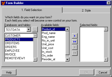
To add fields to a form with the Form Builder
The Form Builder creates a form without navigation controls, so you can add your own. You can use a control builder to add navigation controls to your form, or choose from the predefined library of navigation controls provided with Visual FoxPro. For more information, see Adding Controls to a Form later in this chapter.
When your form is finished, you can save it for future use.
To save a form
Forms are saved as files with an .scx extension.
Once you have saved a form, you can run it to see how it works.
To run a form
-or-
You can also choose the Run button on the Standard toolbar.
Tip When running a form, you can quickly switch to design mode by clicking the Modify Form button on the Standard toolbar.
You add new controls by selecting them from the Form Controls toolbar, and placing them in the Form Designer window. For example, you might want to add new labels for fields on the form, add new controls such as buttons, edit boxes, list boxes, and so on, or add pictures or lines and shapes to enhance the appearance of your form.
To add a control to a form
The new control appears where you placed it. You can then move it to its final location on the form, and resize it as needed.
If you want help adding a control, you can use a builder to add the controls and make them work with the form, or you can add the controls using the Form Controls toolbar and the Properties window.
Just as wizards can be used to construct forms quickly, builders can be used for adding controls to a form. The builder asks a series of questions related to the control you are adding to your form, and sets the appropriate properties to make the control work as desired.
For example, if you want to add a new text box to a form, the builder asks which style of text box you prefer and which table’s field it should display.
Builders can be accessed in one of two ways: from the Form Designer shortcut menu, or by activating the Builder Lock button on the Form Controls toolbar when you add controls to a form.
To add a control with a builder
A quick way to add a new field to a form is to use the Form Builder. Even if you already have fields on your form, you can add new fields that match the style of existing fields. You can also choose different sources for the fields you add to the form, making it easy to add fields from other tables or views to your form.
To add fields to a form
By setting the Builder Lock button on the Form Controls toolbar, you can automatically use a control builder each time you add a control to a form.
To turn on the Builder Lock
You can use the Component Gallery to quickly add custom controls and objects to a form. The Component Gallery contains dozens of custom controls and objects that greatly reduce the amount of coding required to create specialized forms.
To open the Component Gallery
When the Component Gallery is open, you can drag custom controls and objects from the Component Gallery and drop them on a form.
If you create a form with one of the form wizards and then want to add controls to it, you can match the style of the existing controls by using the controls in the wizard controls library, Wizstyle.vcx.
When you open the wizards control library, wizard-style controls (such as chiselfield, embossedmemo, and so on) are available in the Form Controls toolbar. To find out which control to use, select an existing control and note its class and class library. For example, a standard wizard field would be in the Standardfield class, found in Wizstyle.vcx.
Tip Use ToolTips on the Form Controls toolbar to help you identify class names.
To match controls in a wizard-generated form
Note If you move a form to a new directory or another system, you should move the control library associated with the form along with it.
To add a new control to a form without using a builder, just select the control you want from the Form Controls toolbar, and drop it on the form.
Some controls, such as labels, shapes, and lines, do not display data from a table or view, or perform an action. But most other controls do, and you need to tell Visual FoxPro what field you want them to display, or what action you want them to perform. For example, you usually want a text box to display the value from a field, and a button to execute a command.
To make new controls work properly in your form, you need to associate, or bind them with the table and field you want them to display. You link the control to its control source — the data you want it to display or the field where you want entered data to be stored — by setting the ControlSource property in the Properties window.
For example, if you add a new text box to a form, you need to tell Visual FoxPro where to get the values for the text box by setting the ControlSource property to point to a field in a table or view. You can then set other properties to control the appearance of the control.
A tool called the Data Environment Designer makes it easy to add a new field to a form and set the ControlSource property for the field.
By placing the tables or views associated with your form in the data environment for your form, you make it easy to bind new controls to the fields in the tables or views.
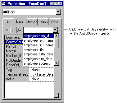
When you have finished setting up a data environment, the ControlSource property field displays the fields available in the Data Environment Designer so you can select the one you want to bind to the control.
If you are editing a form created by a wizard, you will find that the data environment for your form is already populated with the tables or views you used when setting up the form with a Form Wizard.
To display the data environment
Data Environment Designer
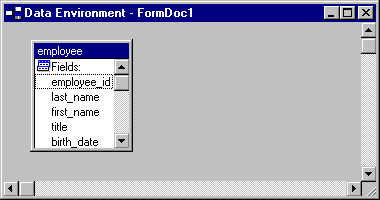
To add a table or view to the data environment
Note If the data environment is empty, the Add Table or View dialog box appears automatically.
Note To add views to the Data Environment Designer, you must have a database open.
The Form Controls toolbar makes it easy to add a new control to your form so you can display a field from your table or view. You’ll want to select the type of control appropriate to the type of field you are displaying. For example, use a text box control to display a single-line field or select an edit box control to display a memo.
The Properties window displays all the properties for the controls you add to a form. You use the ControlSource property in the Properties window to bind the control you have added to your form to a specific field in the table in your Data Environment Designer.
To display the Properties window
Note If you want to use the Properties window to set control properties, make sure Builder Lock is turned off.
To add a new field to a form
-or-
Select a field from the list of available fields.
Available fields for the ControlSource property of a control
When you choose the Button Lock button, you can add multiple controls of the same type without having to click the control button on the toolbar more than once. For example, if you want to add five text boxes to a form, make sure the Button Lock button is selected, and then click the text box control button in the Form Controls toolbar once and add all five text boxes to the form.
Button lock is automatically engaged if you double-click on a control button on the Form Controls toolbar. To turn button locking off, click the Button Lock button again or click the Selection Pointer button on the Form Controls toolbar.
You can quickly create single or multiple controls by clicking on fields or tables and dragging them directly onto a form. You can drag fields or tables from any of the following data sources and drop them on a form or a container class that you are designing:
When you drag a field or table onto a form, Visual FoxPro determines what type of control to create based on options you set.
You can specify the type of control that is created when you drag a field or table onto a form. For example, you can create a text box control any time a Character field is dragged onto a form.
To map field types to classes
To set the class that is created whenever you drag a table or multiple fields, select Multiple from the Type list.
| To… | Select… |
| Create a label in addition to the bound control when you drag a field or table to a form or container | Drag and drop field caption |
| Set the Comment property of the bound control to the text specified in the Field Comment box in the Fields tab of the Table Designer | Copy field comment |
| Set the InputMask property of the bound control to the input mask specified in the Fields tab of the Table Designer | Copy field input mask |
| Set the Format property of the bound control to the format specified in the Fields tab of the Table Designer | Copy field format |
Note You can also specify classes for dragging and dropping in the Display Class box in the Fields tab of the Table Designer. The settings in the Table Designer override the settings you specify here.
You can quickly create a single control based on the field type mapping you specified on the Field Mapping tab in the Options dialog box. You can also override the default mapping and create a different class type.
To create a single control
Note The ControlSource property of the newly created control is set to the Name property of the field.
To create a single control and override the current field mapping
You can drag an entire table onto a form. By default, a grid control is created when you drag a table onto a form. You can override the default and create multiple controls corresponding to the default field type mappings specified for each field in the table.
To create a grid control
To create multiple controls
If the wizard- or builder-generated forms don’t quite fit your needs, you can modify them with the Form Designer. Using the Form Designer, it’s easy to move and resize controls, copy or delete controls, align controls, and modify the tab order.
To modify a generated form
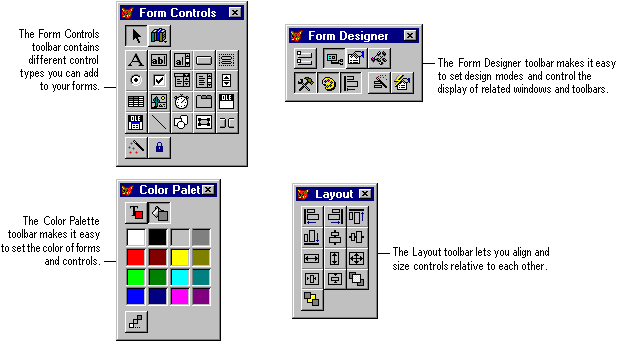
The Form Designer toolbars give you quick access to frequently used commands and the layout, alignment, and color controls you need when designing or modifying forms. For more information about the purpose of each button on each toolbar, you can use the ToolTips feature or search for “Toolbars”.
The Form Designer toolbars
After creating a form, you may need to adjust the placement or size of the controls on the form. For example, you might want to move a memo field, or make a text box longer.
To select a control
To select adjacent controls
To move a control
-or-
Select the control and use the arrow keys to reposition it.
To resize a control
When designing or modifying a form, you may want to make a copy of a control which is already on the form. You can copy an existing control and paste the copy onto your form.
To copy a control
If you create a control and then decide you don’t need it, or don’t want a control created by a wizard, you can remove the control.
To delete a control
The buttons on the Layout toolbar make it easy to accurately line up controls in relation to each other in your forms. For example, you might want to align controls horizontally or vertically or make sure that a related set of controls has the same width or height. To align controls, select a group of controls, and then choose one of the layout buttons on the Layout toolbar.
For more information, see “Aligning Controls” in Chapter 7, Designing Reports and Labels, and see the Layout Toolbar topic.
If you need to place controls precisely on the screen, you can use Show Position on the View menu. When checked, Show Position displays the coordinates and dimensions of a selected control in the status bar at the bottom of the Form Designer window.
Control coordinates and dimensions shown in the status bar

The grid display helps you align controls on your forms. You can adjust the size of the grid with Set Grid Scale on the Format menu. You can turn display of the grid on and off by using the Grid Lines command on the View menu, or setting the Grid Lines option on the Forms tab of the Options dialog box.
You can also adjust the size or position of controls in relation to the grid with Snap to Grid on the Format menu. When Snap to Grid is checked on the Form menu, controls placed on a Form are automatically aligned to the guidelines on the grid. You can override the grid by:
The tab order of a form determines the sequence in which the controls are selected when a user presses the TAB key to move through the form.
You can choose two different methods for setting tab order: interactively, by clicking the controls in the order you want them to be selected when the form is used; or by arranging a list of controls in a dialog box.
To choose a tab ordering method
In interactive mode, you set tab order by double-clicking the control you want to be first in the tab order, and then single-clicking on the rest of the controls in the order in which you want them to be selected in the form.
To change the tab order interactively
In list mode, you set tab order by rearranging the control names in the Tab Order dialog box. You can set order by row (down the form) or by column (across the form).
Setting tab order by arranging a list of controls
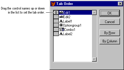
To set the tab order using a list
You can add enhancements to your forms to make them more interesting visually and easier to use. For example, you might want to group similar controls together visually by drawing a box around them, or use bitmaps to give the forms a more professional appearance.
Using the Form Designer, you can customize your forms by:
Using the font properties in the Properties window, you can modify the style and size of the text that appears in controls you have added to your forms. You can choose from the available font styles and sizes supported by your system. To change the text in your form, change the font properties, such as FontName, FontSize, and FontBold, shown in the Properties window.
To change the text in your forms
You can add shapes and lines to forms to customize them. For example, you may want to separate groups of controls with a dividing line, or enclose related controls within a box to set them apart.
To add a line to a form
You can size and move the line like other controls, or change the slant of the line with the LineSlant property in the Properties window.
To add a shape to a form
You can change the type of shape drawn with the Curvature property in the Properties window.
You can add a graphic to the background of your form, or add a picture to a box inside the form.
To add a graphic to your form
-or-
You can control a form’s colors by using the ColorSource property to base the colors on an existing color scheme, or you can use the Color Palette toolbar to change the foreground or background color of your forms and the controls within them.
To set form colors using the ColorSource property
To set the foreground or background color of a form or control
To create a custom color
Visual FoxPro applies the custom color to the current selection.
Setting the form design area lets you customize forms to ensure they display properly under specific resolutions. For example, if you know that users with 640 x 480 screen resolution will be using the form you are designing, you should not select 1024 x 768 as your maximum design area.
To set the maximum form design area
Tip If you select None, the Form Designer will not impose a limit on the size of form you can design.