October 1996
![]()
Previewing the New and Improved Common Controls DLL for Microsoft IE 4.0
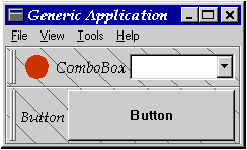
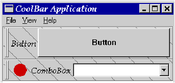
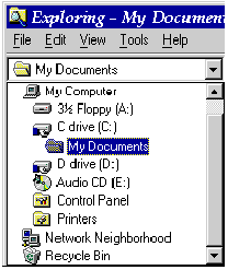
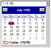
Strohm Armstrong Strohm Armstrong is a support engineer at Microsoft specializing in user and shell technologies. Microsoft¨ Internet Explorer 4.0 (codenamed Nashville; I'll call it IE 4.0 here) introduces three new common controls as well as enhancements to many existing common controls. Many of the common controls now support a new technology called custom draw that allows you to customize the painting of a control without having to implement full-blown owner-draw. The three new controls are an extended ComboBox that provides image list support and indenting, a date and time selection control, and a tool container control (currently called a CoolBar) that lets you customize the layout of different groups of tools. The ListView control now has a method for allowing millions of items to be displayed in it almost instantly, as well as many new features for displaying items in report mode. The Tab control now allows the tabs to be displayed along the sides and bottom of the control, as well as along the top. The list goes on and on. In this article, I'll cover custom draw and the new controls. Next month I will cover the enhancements made to the existing common controls. The sample code included here was built using Microsoft Developer Studio 4.1 with COMMCTRL.H and COMCTL32.LIB from the ActiveX SDK. The ActiveX SDK can be downloaded from http://www.microsoft.com. To run the samples, you will need to have the COMCTL32.DLL that ships with Microsoft Internet Explorer 3.0, beta 2 or greater, installed on your system. (Confused? Here's the skinny: even though these new common controls are not officially released and distributable, they are included with IE 3.0. For now, you have to install IE 3.0 to get them-Ed.) Internet Explorer is also available free to download from Microsoft's Web site. Because these controls are still under development, any detail is subject to change when the final product is released. This can include the addition/deletion of messages and styles, as well as modification to the structures. To make an application more efficient, and to support the new common controls, the InitCommonControlsEx function was added. To avoid having to register all of the common control classes, this function allows you to register only the classes your application will use. This function takes a pointer to an INITCOMMONCONTROLSEX structure, which needs to be filled in before the function is called. The dwSize member receives the size of the INITCOMMONCONTROLSEX structure. The dwICC member receives one or more flags that specify the controls your application needs to register (see Figure 1). The InitCommonControls API can still be called to initialize the Windows¨ 95 common controls. If you're starting a new project, use the InitCommonControlsEx API. Most common controls now support a new technology called hot tracking. With hot tracking, an item is displayed as being selected when the mouse cursor hovers over the item for about a second. This occurs without pressing any mouse buttons. Have you ever wanted to be able to change the way some or all of the items in a common control are drawn? Maybe having some items drawn using a bold font or with a different color? IE 4.0 introduces a new method to control the drawing of items in certain controls called custom draw. The ListView, TreeView, ToolTip, Header, TrackBar, ToolBar, and CoolBar all support custom draw. Custom draw starts with the control sending its owner an NM_CUSTOMDRAW notification with a pointer to an NMCUSTOMDRAW structure (see Figure 2). This message is sent via the WM_NOTIFY message. One of the members of this structure is dwDrawStage, a set of flags that indicates what stage in the drawing cycle the control is currently about to perform. Figure 3 lists all of the drawing stages and when they are sent. The drawing cycle begins when the control processes its WM_PAINT message. At the beginning of the drawing cycle, the control will send the NMCUSTOMDRAW notification with dwDrawStage set to CDDS_PREPAINT. You always get the CDDS_PREPAINT notification first. Other than the fact the CDDS_PREXXX messages always come before CDDS_POSTXXX messages, do not make any other assumptions about the order of these custom draw messages. If the owner returns CDRF_DODEFAULT (zero) to this notification, then custom draw is disabled for that drawing cycle and no more notifications will be sent until the next drawing cycle. If a nonzero value is returned, the control will send additional notifications. Figure 4 outlines the valid return values and the results of each value. Let's say that you want to draw a particular item in a TreeView with a different font and in a different text color. When adding the items to the TreeView, you will need to provide enough information in each item's lParam to determine how the item should be drawn. After returning CDRF_NOTIFYITEMDRAW to the CDDS_PREPAINT notification, you will receive a separate NM_CUSTOMDRAW notification with dwDrawStage set to CDDS_ITEMPREPAINT for each item being drawn. When processing the CDDS_ITEMPREPAINT notification, you will check the item's lParam and determine if the item needs to be drawn differently. If it does need to be displayed differently, then you change the font by selecting the desired HFONT into the hdc member of the NMCUSTOMDRAW structure. Any time you change the font, your return value will need to have the CDRF_NEWFONT bit set. This causes the control to recalculate the extent of the text to be displayed based on the font now selected into the hdc. To change the text color, simply call SetTextColor using the hdc member of the NMCUSTOMDRAW structure. Similarly, to change the background color, call SetBkColor using the same hdc. Since changing the colors does not require the control to recalculate anything, any return value is acceptable. You cannot, however, override the colors for selected items. These will always be displayed using the user-selected settings. If you want to perform all of the drawing for some or all of the items, perform the drawing when you receive the CDDS_ITEMPREPAINT notification. You then return CDRF_SKIPDEFAULT to tell the control not to perform any painting for this item. Since returning CDRF_SKIPDEFAULT causes no portion of the item to be drawn, you will also be required to draw the images for the items. Custom draw has two special cases. The first is implementing custom draw in a ListView. Instead of the lParam of the WM_NOTIFY message pointing to an NMCUSTOMDRAW structure, it points to an NMLVCUSTOMDRAW structure (see Figure 5). The only difference here is that, for the ListView, you place the desired text and text background colors in the clrText and clrTextBk members of the NMLVCUSTOMDRAW structure instead of calling SetTextColor and SetBkColor. The second special case regards ToolTips. When the ToolTip sends the NM_CUSTOMDRAW notification, the lParam points to an NMTTCUSTOMDRAW structure (see Figure 6). This structure consists of an NMCUSTOMDRAW structure (nmcd) and a UINT that specifies drawing flags for the ToolTip (uDrawFlags). These drawing flags are the same drawing flags that can be passed to the DrawText API. Also, a ToolTip only uses the CDDS_PREPAINT drawing stage. The ToolTip will send the NM_CUSTOMDRAW notification twice. The first time will be to obtain the rectangle that the ToolTip should use. This notification is identified by the fact that the DT_CALCRECT bit is set in uDrawFlags. It is in this notification only that any adjustments to the rectangle should be made. The ToolTip will call DrawText with the value in uDrawFlags to calculate the desired rectangle. You should make any desired modifications to uDrawFlags at this time, but always make sure that the DT_CALCRECT bit is set. The second notification will not have DT_CALCRECT set. This is when the control is about to paint itself. You should not make any modifications to the rectangle now, but you should make all other modifications at this time, including changes to the HDC. Also, make sure that you place the exact same flags in uDrawFlags, except for the DT_CALCRECT flag. Figure 7 shows a very basic example of processing NM_CUSTOMDRAW for a ToolTip. This example causes the ToolTip text to be wrapped so that one word is on each line (by specifying a one-pixel wide rectangle for DrawText) and the text will be centered in the rectangle. The CoolBar is a new tool container control that can contain sets of tools in what are called bands. The bands can be arranged so that they take up an entire row or share a row. Figure 8 shows a CoolBar that contains two bands, each in its own row. The top band contains an image from an image list, the text "ComboBox," and a ComboBox; the second band contains the text "Button" and a push button. Bands can also be on the same row, as shown in Figure 9. Figure 8 CoolBar in action: multiple bands in multiple rows Figure 9 CoolBar in action: multiple bands in one row Before creating a CoolBar, you must call InitCommonControlsEx with ICC_ Once you create the CoolBar control, you initialize the CoolBar by sending the RB_SETBARINFO message. This message takes a pointer to a REBARINFO structure as the lParam. The wParam is not used. Figure 11 describes the REBARINFO structure. RB_SETBARINFO sets the image list that will be used by the CoolBar. If you do not wish to use an image list in your CoolBar, you don't need to send this message. You add bands to the CoolBar by sending it the RB_INSERTBAND message. This message takes an index number as the wParam and a pointer to a REBARBANDINFO structure (see Figure 12) as the lParam. The index number is the index at which you wish to have the band inserted. If the index number is higher than the number of bands already in the CoolBar, the band will be added at the end of the list. To ensure you are adding a band to the end of the list, pass (UINT)-1 as the band index. Most bands will contain a child window of some sort. Any window that can be a child can be inserted in a band. The most common use of bands will be to hold ToolBars, ComboBoxes and other controls. First, you create the control you want to put in the band, then place its window handle in the hwndChild member of the REBARBANDINFO structure and set the RBBIM_CHILD flag in fMask. If you want to ensure the band won't be sized too small, set the cxMinChild and cyMinChild members and set RBBIM_CHILDSIZE in fMask. If you want a bitmap to be used as the background of a band, set hbmBack to the bitmap handle of the desired bitmap and set RBBIM_BACKGROUND in fMask. The background bitmap will automatically be tiled to fill in the band. If you want all of the bands to appear as though they have the same background, give each band the same bitmap handle and set RBBS_FIXEDBMP in fStyle. Figure 13 details the fMask flags and Figure 14 describes the fStyle flags. Figure 15 describes all of the CoolBar messages. To delete a band, simply send the CoolBar the RB_DELETEBAND message with the band index in the lParam. When the user exits your application, you will probably want to save the current layout of your CoolBar. To do this, obtain the number of bands by sending the CoolBar the RB_GETBANDCOUNT message. Then cycle through each of the bands, getting the information for each band by sending the CoolBar the RB_GETBANDINFO message. At a minimum, you will need to store the wID and the cx values from the REBARBANDINFO structure. The wID value tells you what order the bands are in so that they can be added in the same order again. Place the cx value in the REBARBANDINFO structure when you add the bands again so that the bands will have the same size as before. You will also need to store any other application-specific information, such as which image is being used and what the band text is. This will depend upon what options you allow users to change. The CoolBar has only one notification message: RBN_HEIGHTCHANGE. This notification is sent to your app via WM_NOTIFY. The lParam for this notification is a pointer to a standard NMHDR structure. RBN_HEIGHTCHANGE is sent whenever the CoolBar is resized vertically, or horizontally if the CoolBar has the CCS_VERT style. The CoolBar doesn't destroy its own image list, so before the control gets destroyed, you should get the handle to the image list by sending the control an RB_GETBARINFO message. You should then destroy the image list manually. I have put together a sample application (see Figure 16 and Figure 17) that demonstrates how to create a CoolBar and add bands to it. (To download the complete sample code, see page 5.) This sample also allows the user to set the position of the CoolBar to the top, left, right, or bottom of the parent window. Figure 16 CoolBar sample program During the initialization of the application, I call InitCommonControlsEx with dwICC of the INITCOMMONCONTROLSEX structure set to ICC_COOL_CLASSES to initialize the CoolBar class. To create and initialize the CoolBar, I created the BuildCoolbar function. This function creates the CoolBar using CreateWindowEx. The function then initializes the CoolBar by filling out a REBARINFO structure and sending the CoolBar an RB_SETBARINFO message. Once the control is initialized, the function creates and initializes a ComboBox to place in a band. The REBARBANDINFO structure is filled out and then the ComboBox band is added by sending the CoolBar the RB_INSERTBAND message. This band includes text and an image. Then a button is created, the REBARBANDINFO structure is filled in, and the RB_INSERTBAND message is sent to add a second band. The button band includes text, but does not contain an image. For this sample, I chose to create the CoolBar with the CCS_NOPARENTALIGN style and to reposition the control myself whenever the main window receives a WM_SIZE message. Another option is to not specify the CCS_NOPARENTALIGN style and let the CoolBar reposition itself. When you choose this method, you will need to forward the parent's WM_SIZE messages to the CoolBar so that it can realign itself with its parent. All command and notification messages from the controls contained in the bands are forwarded to the parent window via WM_COMMAND or WM_NOTIFY messages. The new ComboBoxEx control is basically a ComboBox that supports item images and indenting. This control is very similar to the ComboBox that you see in the Windows Explorer's ToolBar (see Figure 18). I won't rehash how to use a ComboBox here; I'll just explain the basics of creating and manipulating the ComboBoxEx control. All of the ComboBoxEx messages are outlined in Figure 19. Figure 18 ComboBoxEx Before creating a ComboBoxEx control, you must call InitCommonControlsEx with ICC_USEREX_CLASSES set in dwICC of the INITCOMMONCONTROLSEX structure. To create a ComboBoxEx, use the CreateWindow or CreateWindowEx function with the class name of WC_COMBOBOXEX. The ComboBoxEx control supports all of the standard ComboBox styles except for CBS_OWNERDRAWFIXED, CBS_OWNERDRAWVARIABLE, and CBS_HASSTRINGS. The ComboBoxEx has its own set of extended styles (see Figure 20). These extended styles should not be confused with extended window styles as used in CreateWindowEx, SetWindowLong, or GetWindowLong. After creating the control, the extended styles are set by sending the control the CBEM_SETEXSTYLE message. This message takes a DWORD value for the wParam that contains all of the extended style flags to be set. The ComboBoxEx extended styles are retrieved by sending the control the CBEM_GETEXSTYLE message. The return value from this message is a DWORD that contains all of the extended style bits currently set in the control. To add or insert items into the ComboBoxEx control, you fill in a COMBOBOXEXITEM structure and send the control a CBEM_INSERTITEM message. This message takes a pointer to the COMBOBOXEXITEM structure (see Figure 21) as the lParam. To add an item to the end of the list, set iItem in the structure to (UINT)-1. To delete an item from the ComboBoxEx control, send the control the CBEM_DELETEITEM message. The zero-based index of the item to be deleted is indicated in the wParam of this message. The ComboBoxEx control sends more than a few notifications (see Figure 22) using the WM_NOTIFY message. The NMCOMBOBOXEX structure consists of a NMHDR Like the CoolBar, the ComboBoxEx doesn't destroy its own image list, so before the control gets destroyed, you should get the handle to the image list by sending the control a CBEM_GETIMAGELIST message. You should then destroy the image list manually. The Date/Time Picker is a customizable calendar and time control that allows the user to select a date or time in a dedicated field. As its name implies, the control can operate in two modes, date mode and time mode. The mode is controlled by the style bits of the control. When in date mode, the control acts like a ComboBox. The user can edit the date right in the edit control or drop down a monthly calendar. The user can move to the previous or next month by pressing little buttons in the calendar. When the user selects a date in the drop-down calendar, the selected date is entered in the edit portion of the control and the drop-down calendar is destroyed. Figure 25 shows an example of a Date Picker control. Figure 25 Date Picker control In time mode, the control acts more like a UpDown control (see Figure 26). The user can enter text directly into the control or use the up and down arrow buttons to adjust the separate elements of the time. In both modes, the control supports all of the format strings the GetDateFormat function supports. It also supports what are called callback fields in the format string. Callback fields will be explained in more detail shortly. Figure 26 Time Picker control Before creating a Date/Time Picker control, you must call InitCommonControlsEx with ICC_DATE_CLASSES set in dwICC of the INITCOMMONCONTROLSEX structure. To create a Date/Time Picker, use the CreateWindow or CreateWindowEx function with the class name of DATETIMEPICK_CLASS. In addition to the standard window styles, the Date/Time Picker control has its own set of styles (see Figure 27). After the control is created, it will automatically set itself to the current system time. If you want to set the control to a different date or time, you send the control a DTM_SETSYSTEMTIME message. This message takes a constant, GDT_VALID, for the wParam and a pointer to a SYSTEMTIME structure that contains the time to set the control to as the lParam. The wParam can also be GDT_NONE; I will discuss that shortly. To get the current date or time from the control, you send it the DTM_GETSYSTEMTIME message. The lParam for this message is a pointer to a SYSTEMTIME structure that will receive the control's date and time information. By default, the control uses system colors for the drop-down calendar. You can customize the colors that the calendar uses by sending the control the DTM_SETMCCOLOR message. The wParam for this message is one of the values listed in Figure 28. The lParam is a COLORREF value that specifies the new color. To retrieve the currently set colors, send the control the DTM_GETMCCOLOR message. The return value from this message is a COLORREF value that represents the color. You may want to change the format string for the control. The format string controls how the control displays the date or time information. This is done by sending the control the DTM_SETFORMAT message. For this message, a pointer to the format string is given for the lParam. If you don't specifically set the format string, the control will use the default format string from the locale information. To reset the control to the default string, just send the control the DTM_SETFORMAT message with NULL for the string pointer. The control supports the same format strings as those described by GetTimeFormat and GetDateFormat. The control also supports callback fields in the format string. You specify a callback field by placing one or more "X" characters in the format string. When the control parses the format string and sees a callback field, it will send a DTN_FORMATQUERY notification. The lParam for this notification is a pointer to an NMDATETIMEFORMATQUERY structure. This notification asks for the maximum allowable width of a string that can be displayed in that field. This value is placed in the szMax member of the structure. The control then sends the DTN_FORMAT notification. The lParam for this notification is a pointer to an NMDATETIMEFORMAT structure, which gives you the SYSTEMTIME structure that the control is currently set to. You place the formatted text in the szDisplay member of the structure. All of the Date/Time Picker specific messages are detailed in Figure 29, and the Date/Time Picker-specific notification codes are detailed in Figure 30. Custom draw is useful for applications that want to tweak the drawing process without having to fully implement owner draw controls. The CoolBar, ComboBoxEx, and the Date/Time Picker are all useful new controls that should help bring more consistency to the application's look and feel. Next month I will cover the enhanced ListView, TreeView, Header, Progress Bar, and Toolbar controls. Some of the enhancements are minor, such as new flat-look style bits for the Toolbar, while others are major, such as the virtual mode of the ListView (which allows you to commit the GUI blunder of placing a zillion items in a listbox-style control). The Basics
Custom Draw
CoolBar


COOL_CLASSES set in dwICC of the INITCOMMONCONTROLSEX structure. The CoolBar is created with the CreateWindow or CreateWindowEx function using REBARCLASSNAME as the class name. Figure 10 details the CoolBar styles. The CoolBar also supports the standard common control styles (CCS_XXX). The CoolBar Sample

ComboBoxEx

structure (hdr) followed by a COMBOBOXEXITEM structure (ceItem) which contains information about the item (see Figure 23). Figure 24 describes the NMCBEEND-EDIT structure. Date/Time Picker


Conclusion