![]()
|
Download the code (6KB) |
|
Improve Your Input Forms with Dynamic HTML
Christian Morin |
| Prospects of yet another blah Web page getting you down? Soup up your site with a few Dynamic HTML tricks. |
|
Input forms for Web pages often have limited functionality and paltry visual appeal. These limitations often discourage developers from using the Web as the main interface to their product. However, thanks to Dynamic HTML (DHTML) in Microsoft Internet Explorer 4.0, you can
overcome many of the perceived limitations of a Web-based architecture.
Let's look at three techniques you can use to make your input forms appear more like those in standard Windows®-based applications. You'll see how to create labels inside fields, instead of labels placed beside the field itself. I will show you how to post data to the server for validation without the input form disappearing. Finally, I will show you how to create tab controls in DHTML without using images or ActiveX® controls. Creating Background Labels Background labels (see Figure 1) are input fields that have the name of the field written in the top-right corner. The label appears underneath the text that will be typed into the field. This technique saves the space taken up by standard labels, which usually sit in front of the input field. One of the advantages of background labels is that they become invisible in the mind of frequent users. Another advantage is that you can set the labels to any color, font, or size so that they match the theme used in your page. |
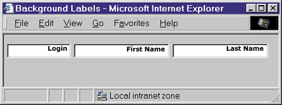 |
| Figure 1: Background Labels |
|
The key elements to creating background labels are absolute positioning and transparent backgrounds for the input fields. Both are implemented using style sheet properties. Absolute positioning allows you to place HTML elements at specific locations in the browser window. Before absolute positioning, elements in a Web page were laid out according to the order they were defined in the source code. With absolute positioning, it does not matter in which order you define your elements. Theoretically, you could define the elements in any order you want and they would still be displayed correctly, since the style sheet positioning of the elements does not change. This means that when you resize your screen, your elements don't move around as they do in relatively positioned pages. Transparent backgrounds are nothing more than HTML elements with background colors set to transparent, which is a special color in Internet Explorer. The transparent color lets the user see what is underneath the element itself. The background-color style sheet attribute is used to set the background color of an HTML element. Creating background labels is very easy (see Figure 2). For every <INPUT> element in your form, you need a matching <SPAN> element. This <SPAN> element contains the text of the label itself. Notice that I use the same class name for matching <SPAN> and <INPUT> elements, so I can modify the position of the element in one place in my source code, instead of two. The class definition itself (clsLogin) in the <STYLE> element contains five attributes. The first attribute, position:absolute, tells the browser that elements of that class should use absolute positioning. The other position settings are relative or static, which means the position is based on the natural HTML flow. The top and left attributes specify the upper-left position of the element. The unit I used here is pixel (px). If your screen resolution is 1024 X 768, you can set the pixels anywhere in that range. Although you are not limited to that size, setting the coordinates greater than your screen resolution (the browser size, in fact) will make your page scroll. The width and height attributes specify how big your <INPUT> element will be (I also used the pixel unit for these). Other units you can use for absolute positioning are points (pt), inches (in), centimeters (cm), picas (pc), and millimeters (mm). The class definition specific to <INPUT> elements, INPUT.clsLogin, contains only one attribute. The background-color:transparent attribute makes the background transparent, so the user can see what's underneath the <INPUT> element. In this case, it's a <SPAN> element containing the text for the label. Using a color other than the transparent color would obscure the label. The class definition specific to the <SPAN> element (SPAN.clsLogin) contains six attributes. The attribute text-align:right tells the browser to display the label in the upper-right corner. The attribute font:bolder 7pt Arial specifies a 7-point Arial typeface with a bolder weight (bolder is one degree darker than bold). You can use any font you want, but it must blend with the font used in the <INPUT> element or the text typed in the field will be harder to read. The background-color attribute is the color you will see at the back of your <INPUT> field since its background is transparent. I chose white as the background color, but any color can be used. The color attribute is used to display the label's text. It is important to choose the right brightness for your label. If the label is too pale, users will have a hard time seeing it; if it is too dark, it will interfere will the <INPUT> element's text. The last two attributes, letter-spacing and padding-right, are purely for aesthetics. The letter-spacing attribute adds the specified amount of space between each letter, making the label more easily distinguished from the text typed in the field. The padding-right attribute adds the specified amount of space to the right of the selected element, preventing the label from being too close to the edge of the field. This simple background technique can also be applied to <TEXTAREA> elements, allowing you to apply background labels to all elements that take text as input. As I mentioned previously, you can declare your absolute position elements in any order. This is not exactly true, however. In this example, if the <SPAN> elements are declared after the <INPUT> elements, you will not be able to input any text because Internet Explorer stacks overlapping elements in the order they were declared. To solve this problem, make sure you specify the <SPAN> elements before the <INPUT> elements, or use the z-index style sheet attribute. Basically, the z-index attribute tells Internet Explorer which element goes where in the z-axis (front to back). If element A has a z-index greater than the z-index of element B, element A will be positioned on top of element B. Posting Forms in Hidden Frames One major difference between a Web input form and a standard Windows-based application form is that when you click the Submit button, the input form disappears and is replaced by another Web page. To a user, there is nothing more annoying than submitting a form and getting back a page saying "You must specify an email address."
|
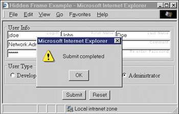 |
| Figure 5: Submit Complete Message |
|
Over a slow connection, a user might be tempted to click on the Submit button again if the response takes a long time to arrive. This problem can be solved by disabling the button until the post returns. You could even change the cursor to a busy cursor using the cursor:busy style sheet attribute.
|
 |
|
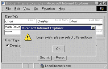
Figure 6: Alert Message
|
|
Using a Lightweight Tab Control
Until DHTML arrived, developers had to rely on ActiveX controls to offer features like the tab control that people are used to in standard Windows-based applications. A tab control appears as a row of folder tabs on top of a pane, allowing multiple pages to be displayed in the same window, separating the information into logical groups. Tabs are rarely used on the Web and are usually simulated with images and frames. The tab control that I will demonstrate is created entirely with DHTML—no images, frames, or ActiveX controls are used—and is approximately 50 lines of code.
|
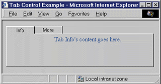 |
| Figure 7: Tab Control Using DHTML |
|
Figure 7 shows the tab control created using DHTML. In this example, there are two tabs: one labeled Info and the other labeled More. To keep the code simple, I only put the sentence "Tab Info's content goes here" where the actual content would go. When the user clicks the More tab, he will see the content that says "Tab More's content goes here." The code required to create this example is shown in Figure 8 . It contains three main sections: the <STYLE> section, the <SCRIPT> section, and the HTML <BODY> section. Each section is interlaced to create the actual tab control. A tab can be in one of two states: selected or not selected. Each tab can have one of the following identities at any given time: the selected tab, the tab left of the selected tab, the tab right of the selected tab, or the tab not adjacent to the selected tab. This classification is used to produce different visual effects. For example, the selected tab does not have a border separating the tab from the body of the page. Now let's examine the HTML code behind the tab control. The <TABLE> element is responsible for most of the control's appearance. The table contains two rows, where each row contains n+1 columns (n being the number of tabs). The first row is used to create the tabs containing the labels. You will notice that most of my HTML elements have an id or a class, which are used in the script or style sheet sections. The first row contains a <TD> element for each of the tabs plus an extra <TD> element at the extreme right to create the elongated effect of the tab control. You must set the correct class for each of the tabs according to the initial state you want the tab control to be in when the document is loaded. Set the class of each tab (<TD> element) according to the rules shown in Figure 9. Note that the column without a label at the extreme right should not have a class because it is not a tab. In my example, I made the first <TD> element the selected tab, so it was given the clsTabSel class. The next <TD> element then gets the clsTabSelRight class. Since I have only two tabs, I do not use the other classes. The second row of the <TABLE> element is used to create the space where elements are going to be displayed. The table is just used for positioning here; the elements you display on the tab page are not part of the table, but part of a <DIV> element that will overlay it. You should have the same number of columns in this row as in the first row. Each column (<TD> element) should have one of the following two classes: clsTabContentSel matches the default selected tab column and clsTabContent does not match the default selected tab column. You must also give the id tdLeftSide to the leftmost column and the id tdRightSide to the rightmost column. In this code, I have added inline style definitions to the columns with labels. I specified the width attribute for each of them so that longer labels will fit and smaller ones will take less space. This allows for maximum customization of the appearance of the tabs. Note that if the sum of the width elements is longer than the size of the <TABLE> element, you will end up with a funny-looking control. Now that you are familiar with the HTML code behind the tab control, let's take a look at the <STYLE> section. The style sheet attributes are the key to creating the right look for the tab control. By selecting the appropriate border and color, you can create a 3D effect and give the illusion that the selected tab is on top of the other tabs. The border attribute has three settings: width, style, and color. The width setting is always 1 pixel except for the top of the selected tab, which is 2 pixels. The style setting used for the tabs is always solid or none. The color setting uses two user-defined system colors: threeddarkshadow and threedhighlight. (See the sidebar "User-defined System Colors" for more information on colors.) Another point of interest in my <STYLE> section is the trTabList id. I used the cursor:hand attribute to turn the cursor into the shape of a hand when the mouse pointer hovers over the tabs. I overwrote this attribute directly in the last <TD> element of the first row. Because this column is not a tab, the cursor attribute should be set back to the default type. The final part to look at in the <STYLE> section is the <DIV> element ids. I used absolute positioning to make sure that the <DIV> appears over the tab control. Any elements you put inside the <DIV> element now appear on top of the tab control. In this case, I have only one line of text in each <DIV> element to keep the code short. The HTML and <STYLE> sections create the look of the tab control, but the scripting section makes it functional. The tab control uses two main functions (onClickTab and SetTab), as well as an onEnter and onLeave function for each of the tabs. You also need two global variables, intNumTabs and intCurrentTab. The intNumTabs variable should be set to the number of tabs you have in your control. In this case, it is set to 2. The intCurrentTab variable is the index (starting at 0) of the currently selected tab. In my example, the first tab is selected by default, so I set the intCurrentTab variable to 0. In the HTML section, you may have noticed that I set two events in the first <TR> element of my table. These events are used to trigger the code that takes care of swapping the tab pages. I used the <TR> element, as opposed to the <TD> elements, which contain the labels for the tabs, to eliminate repetitive code. The first event, the onClick event, calls the onClickTab function. The onClick event fires when the user clicks on any one of the tabs. I cancel this event in the last <TD> element, since it is not a tab. By canceling the event in the <TD> element (by setting the cancelBubble property of the event object to True), I ensure that it will not bubble to the row's onClick event. In the Internet Explorer Document Object Model, events bubble from the innermost element to the outermost one. The other event, onSelectStart, calls the onClickTab function as well as returning False. The onSelectStart event fires when the user starts a text selection (by dragging the mouse pointer over text while pressing the left button). Since the tab labels are text, the user can technically select them. This is not something you want the user to do. To stop the user from selecting the label, I return False, which cancels the selection. By calling the onClickTab function, I interpret the selection event as a click event. This makes the tab easier to click, since both the onClick and onSelectStart events are considered click events. Notice that I also canceled the onSelectStart event for the last <TD> element, for the reasons mentioned previously. The onClickTab function is used to make sure the click event is coming from a <TD> element and that the user did not click on the already selected tab. If both conditions are true, the SetTab function is called with the index of the <TD> element the user has just clicked. The SetTab function plays three roles. First, the function calls the onLeave function for the currently selected tab. This makes the content of that tab invisible (and whatever else you want to do in the onLeave event). Second, the function loops through the <TD> elements of the first row of the table to set the correct class according to the newly selected tab. As soon as you assign a new class to a <TD> element, DHTML takes care of updating how it looks. Third, the function calls the onEnter function of the new tab. This takes care of showing the content of the new tab (and whatever else you put in there). The onLeave and onEnter functions of each tab can contain any code you want. Most likely, these functions will contain code to make the content of the tab appear or disappear using the visibility style sheet attribute of the appropriate <DIV> element. In my example, I have two <DIV> elements, one for each of the tabs. If you take a look at the onLeaveInfo function, you can see how I make the <DIV> element invisible by setting its style.visibility property to "hidden". This is all you need to create the tab control. Using this technique, you can now create powerful, versatile tab controls that will add visual appeal and great functionality to your input forms. The good part about this code is that it can be generated from a component that will take care of a variable number of tabs. This component can then be called from an ASP page to generate any tab controls you need in your application. Figure 10 shows what such an ASP page might look like. In the sample ASP page, the component is called HTML-Tools.TabControl and has two methods, AddTab and Execute. AddTab is called once for each tab in the control. Its parameters are the name of the tab, the name of the onEnter function, and the name of the onLeave function. The Execute method then generates the appropriate code directly in the output page using the Response.write method of the ASP page. Then all you have to do is define the onEnter and onLeave functions as well as whatever content you want to put in the tab control. This method makes your ASP code clear and easily maintainable. |
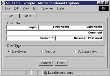 |
| Figure 11: Lots of DHTML Tricks |
|
I've shown how to improve your Web input forms by using simple techniques with DHTML to make your forms behave and look more like standard Windows-based applications forms. You've seen how to use the background-color:transparent style sheet attribute to make background labels in your input fields. I have also explained how you can post form data to the server using a hidden <IFRAME>. This allows for server-side validation without losing the input form. Finally, I presented a technique for creating tab controls using a <TABLE> element with 3D borders. Figure 11 shows an input form that combines all three techniques. As you can see, DHTML really brings power to the Web developer willing to harvest it. |
 |
|
http://msdn.microsoft.com/workshop/author/forms/formsoverview.asp
http://msdn.microsoft.com/workshop/author/default.asp |
From the February 1999 issue of Microsoft Internet Developer.